
I recently ran into a requirement to do a PoC on a PowerApps to be able to add and update records in a single screen in PowerApps. In order to implement the PoC I decided to test this out on the Contact Entity in a Dynamics 365 environment. I did not make any changes to the Contact Entity, but just used some of the Out of the Box fields. In order to implement this, I wanted to get a look and feel of a form that would look the same whether entering new information or editing existing information.
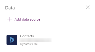
We start by creating a blank Canvas up using the Tablet layout. This will open a blank screen. On the screen we see the message Add an item from the Insert tab or connect to data. We click on connect to data, and select either new connection if you don’t see your dynamics 365 connection from there, or if it is displayed click on the connection. Select the connection (and authenticate if required), select the dataset (instance) and then in the Choose a table, select the Contacts entity. Click on Connect. The image below shows you the Data sources window after you connected to the environment.
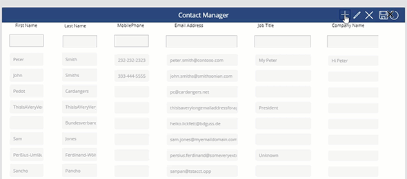
The next thing that we are going to do is add the header of the application. We do this by adding a label and a few icons that will each perform an individual action. As a good practice, use actual names for the screen and controls that you add to the form. There is no logic implemented yet. We then add just labels to the top of the page that will hold the fields that we want (in our case it is First Name, Last Name, Mobile Phone, Email Address, Job Title and Department), and separate them across the form. The image below shows you the customized labels and icons that we added to the form.

After adding the labels and icons, it is time to add the form and gallery. We start by adding a form. On the Insert Tab we will add a new form. We set the data source to Contacts and add the fields required by clicking the Edit fields link on the Properties window. We set the # of column to 12, Vertical Layout, and the Default Mode to New. You can customize the look and feel as needed.
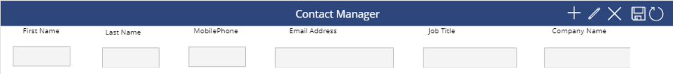
By default, when adding a new form, each field will have a label associated with it. Since we want to use a single layout for Adding and Editing the fields, we will hide the fields, and just use the actual input controls for each data card. We do this by clicking on the DataCardKey label for each of the for attributes that we added, and setting the Visible property to Off and the Height to 0, so that it is not visible on the form. We then customize the form fields so they appear as a single line by modifying the size and the position of each data card. The result will look like this:
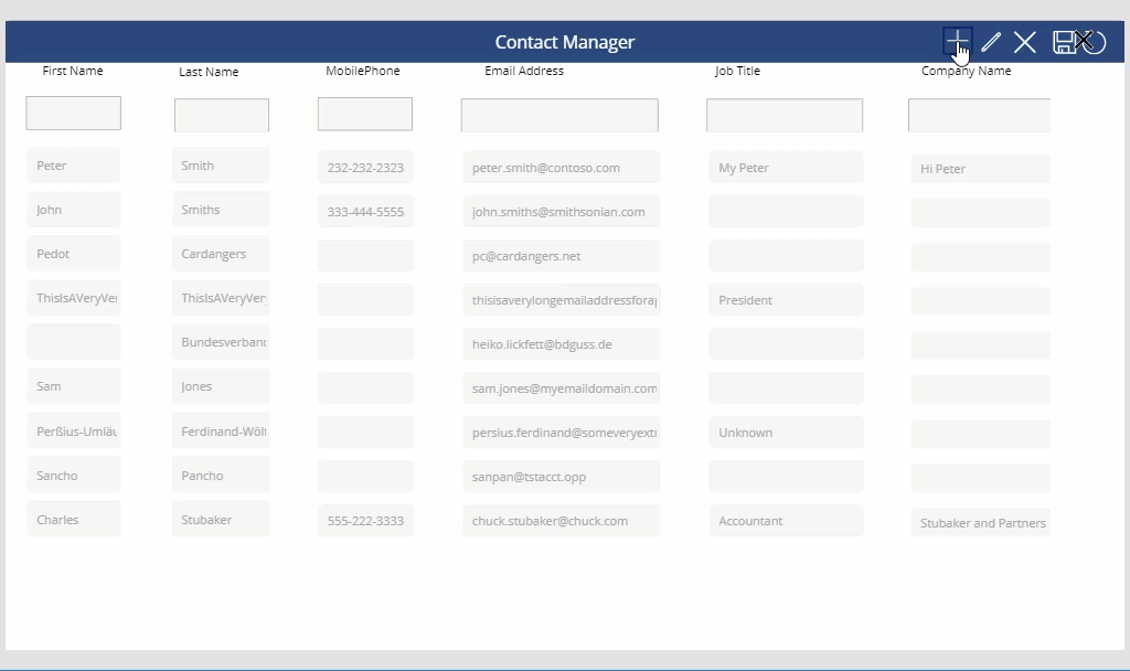
Finally we will add the gallery. We use a Blank Gallery layout, and set the data source to the Contacts data source. We add one field at a time as Text Input controls and associate them with the correct field and position that we added to the for the form. This will give us a look and feel that is similar to a grid containing a top row to add new data, and the rest of the rows for editing existing data.
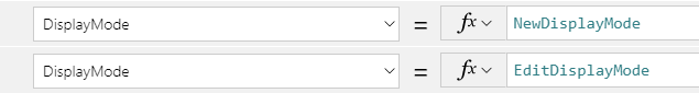
It is not time to start adding the functionality to the icons, form and gallery. We will first add two global variables to the App. In the App OnStart function we will Set the following variables:
Set(NewDisplayMode, DisplayMode.Disabled); Set(EditDisplayMode, DisplayMode.Disabled);
This will create two new variables, once for the display mode of creation of new records, and the other for the display mode for editing existing records. This was my PoC requirements, so yours might be different.
Next, we will set the all of the fields to the display mode variables that we created, so that when new forms are created, it forces us to choose the action that we want to perform, such as New Record, Edit, Cancel or Save. We would loop through all the input controls in the Form and Gallery, and set their DisplayMode to either NewDisplayMode for the Form or EditDisplayMode for the gallery.
Next we will add logic to each of the icons that we added to the header (shown in the table below):
|
Icon |
Code Logic |
|
Add New |
UpdateContext({NewDisplayMode: DisplayMode.Edit}); UpdateContext({EditDisplayMode: DisplayMode.Disabled}) |
|
Edit |
UpdateContext({NewDisplayMode: DisplayMode.Disabled}); UpdateContext({EditDisplayMode: DisplayMode.Edit}) |
|
Cancel |
UpdateContext({NewDisplayMode: DisplayMode.Disabled}); UpdateContext({EditDisplayMode: DisplayMode.Disabled}) |
|
Save |
If (NewDisplayMode = DisplayMode.Edit, If (!IsBlank(LastNameField) && !IsBlank(EmailAddressField), SubmitForm(AddNewForm); ResetForm(AddNewForm); Refresh(Contacts), Notify(“Cannot create record. Missing data.”, NotificationType.Error)), true); UpdateContext({NewDisplayMode: DisplayMode.Disabled}); UpdateContext({EditDisplayMode: DisplayMode.Disabled}) |
|
Reload |
Refresh(Contacts) |
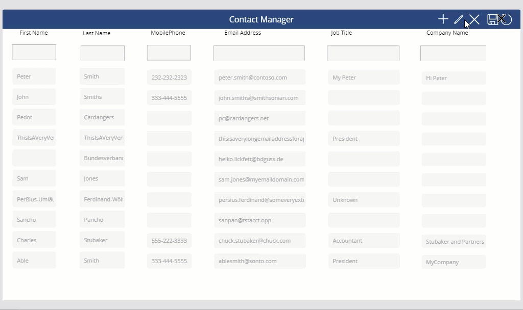
We are now ready to test the application. The animated gifs below shows how the application runs:
You can download a copy of the solution from here. After importing the solution to your environment, you might have to make some configuration changes to your Dynamics365 environment. The purpose of the linked download is for informational and educational purposes only and not intended to be a full solution. We will post the full solution on github and a later date.